


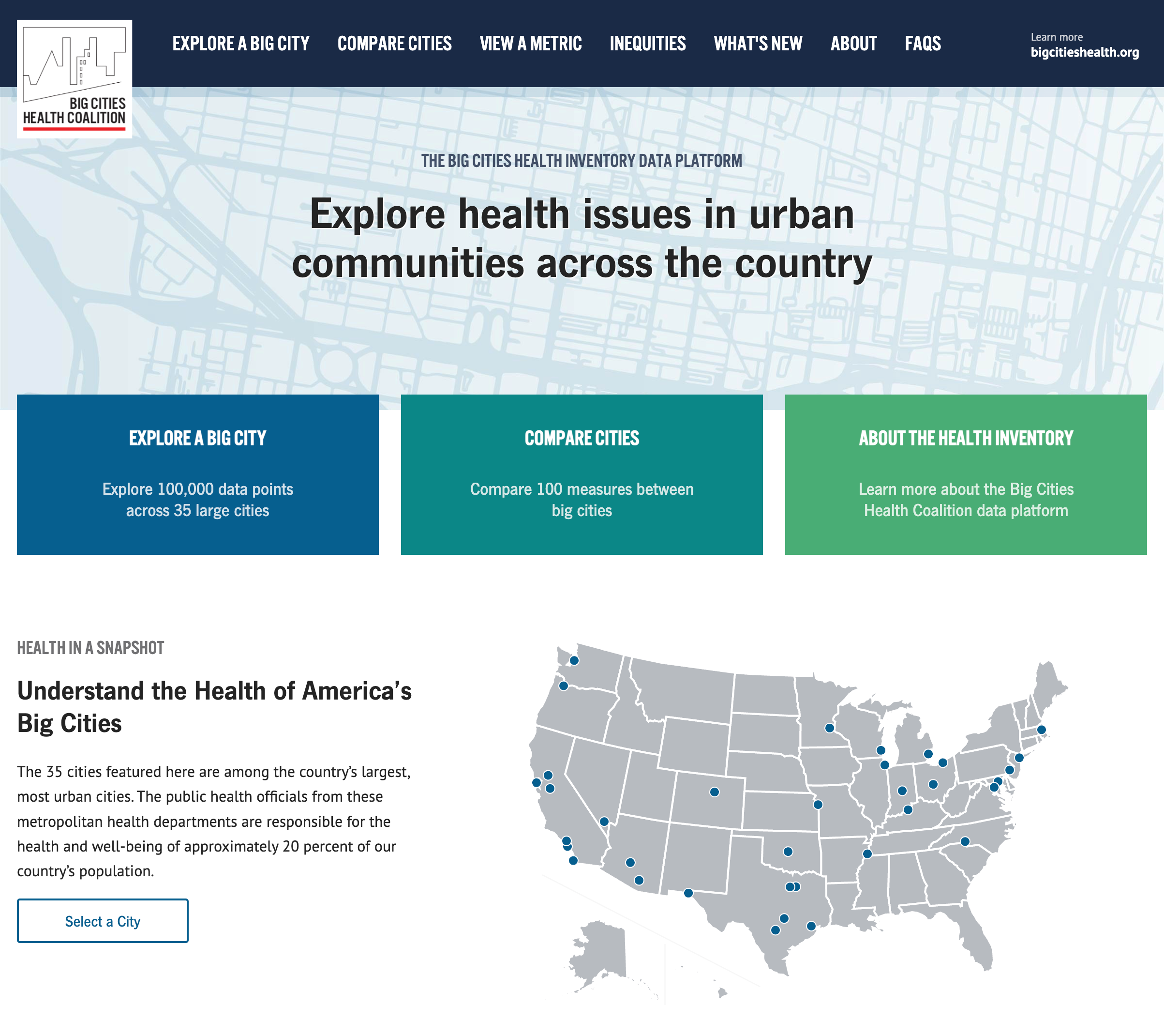
Last year Drexel University, in partnership with the Big Cities Health Coalition, contacted us to build a website to visualize health data for urban areas in the United States. Their data analysts gathered data around metrics like HIV infections, COVID deaths, diabetes, and other significant health concerns. They needed a website allowing policymakers, educators, students, and the public to explore this data. We are always looking for projects that do public good, and our past experiences designing and implementing report builders made our partnership with Drexel a perfect match. Together, we built and launched bigcitieshealthdata.org.
We faced a few significant challenges throughout the project:
- Drexel compiled a rich dataset, and we needed to understand it well enough to structure the database, construct filters, and more. However, the data was still in flux. We also aren’t academics, and the team at Drexel is not comprised of web developers.
- We needed a solution to upload large amounts of data to the website without timeouts, website breakages, or downtime. People depended on the accuracy of the data shown, so we could have any issues with maintaining the live data.
- Finally, we needed to allow visualization of the data in a meaningful way. We needed to determine which filter mechanisms worked best, which charts were appropriate, and how it would all come together as a pleasant experience for users.
Let’s go over how we made it all work!
Our solution
The Drexel team was passionate about this project, and it showed. They were responsive to questions and detailed in their requests. They did a lot of “homework,” exploring problems as a team and communicating their findings in writing. Having an engaged client always boosts our ability to be successful.
As a team, we met regularly to discuss the budget, and project progress, review designs, data modeling, and more. If a topic got too sticky, we would agree to a sidebar conversation or sort things out later with fresh thinking. Regular communication and iteration allowed us to power through practically every problem.
Understanding the data
Before we could get too far, we had to understand Drexel’s dataset. We learned the key terms and definitions used to describe the data, its various relationships, and their significance. Once we had a shared language, we set up a document where the Drexel team could provide short descriptions of all available columns. This document would grow to explain, in plain language, the needed tables, hierarchies, and relationships within the database.
Some data points are tied to single or multiple records. Source information, for example, was common to numerous records from the same indicator but varied by location and year. Storing it with each record or in a separate table would change how this information was retrieved when building charts and their footnotes.
It was challenging to define the columns that stored stratification data. Drexel had indicators stratified by sex and race, some by both, but they needed the system to be generic enough to allow new stratification fields in the future. We devised a convention for column names that determined the resulting stratification fields and if the records were single or cross-stratified.
Lastly, we had to design the data model with only a few examples of real-world data. It wasn’t until later that Drexel would complete their data gathering and analysis. Both our teams scrutinized early database architecture decisions to avoid costly changes down the road.
Handling Import
Drexel needed to maintain and update website data with developer assistance. Importing and processing large datasets comes with several challenges we had to overcome. We needed to ensure the integrity of the data, so we had to abandon an import if we hit errors and roll back to a working version of the website to avoid interruptions. Importing by row would take hours, and importing all at once risked errors as relationships were interconnected, and some might not exist at the beginning of the process.
Our solution was to process the spreadsheet twice. The first pass created all top-level objects—categories, indicators, stratification labels—and stored database keys in Python objects. The second pass would process individual records in a bulk operation, referencing the first-level objects.
This process required several minutes to complete, so we needed to run it outside of the web server’s request/response cycle. We weren’t happy with the operational overhead associated with introducing Celery or the potential stability issues of extending the web server’s timeout. Instead, we used a Python subprocess. The import script made a temporary copy of the uploaded CSV file and delegated the actual processing of data to a management command, calling it via a subprocess. The status of the operation was stored in a database table. The user received a message saying the import was being processed and was asked to refresh the page in a few minutes to check if the status had changed.
This solution may not be ideal for a system with different user profiles, but it was more than enough for an upload done once or twice a year from the Django admin interface by a non-developer. The pragmatic nature of this solution meant we had more budget to focus on other features. Additionally, Drexel didn’t need to rely on a developer to make site changes or fix and maintain fragile import scripts.
Visualizing the data
Designing each data visualization page, its filters, and all of the interactive elements involved everyone on the team. Drexel had a strong sense of what they wanted at a high level, but we still needed to prototype the interface and iterate on details to get it just right.
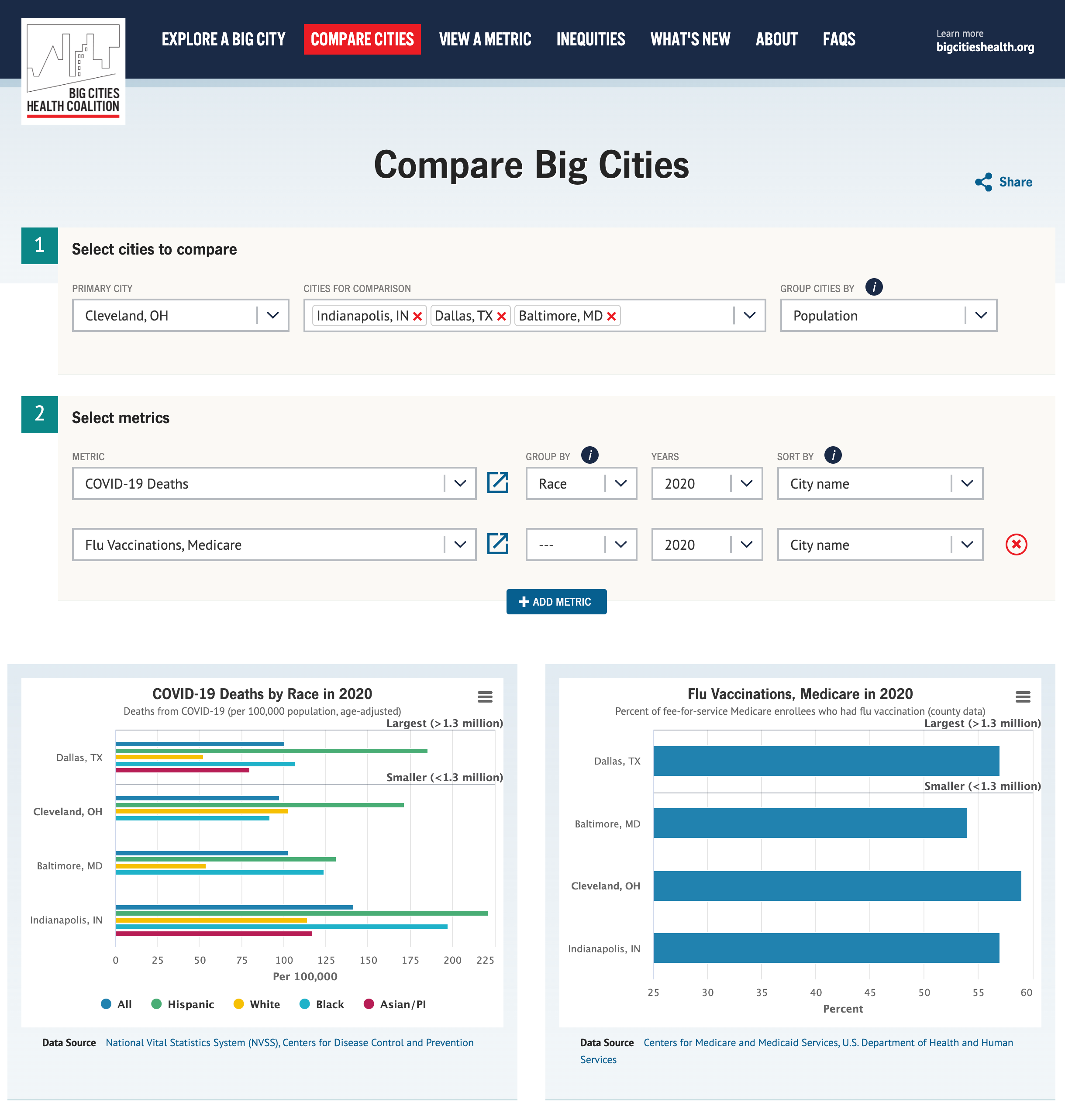
The data consists of health indicators in multiple cities over a few years. Each of the three visualization pages would focus on one way of exploring the data: view a single city, compare cities and explore a metric. We wanted to allow the user to build multiple charts with different filtering and grouping criteria for all views. The views are powered by a robust REST API, each having a predetermined set of controls. The team selected Highcharts for the chart rendering and Vue.js for managing user state.
The most challenging problem we faced with data visualization was providing optimal experiences based on selected filters. We had to examine common and edge use cases and make decisions about rendering readable charts. If left to defaults, many charts lose meaning, appear broken, or communicate the wrong idea at a glance.
Here are some examples:
- Viewing a time series is visualized differently if viewing a single city or multiple cities. Multiple cities across time are represented as lines, but too many lines for too many years makes a chart unreadable. We detected this and limited filter controls.
- For stratified data, when displaying metrics across multiple cities, we opted to split a single chart into groups of many. For example, you select multiple cities for Adult Obesity statistics, but the Male and
- Female group results into two separate charts.
- When the charts got too busy, we adjusted the bar, line, and font sizes.
- In some situations, we introduced tooltips to provide details on data points.
- We adjusted the color palette to complement the data display of specific charts.
The rules engine in Vue.js grew to become quite complex but remained manageable by any competent front-end developer.
Final thoughts
We’re very proud of our work on bigcitieshealthdata.org and are thrilled with its results. The project went smoothly and was delivered on time and within budget due in part to the Drexel team’s commitment to collaboration and thoroughness. The project was built with Lincoln Loop’s ethos in mind, with many solutions being elegant yet pragmatic in their implementation.
This pragmatic approach was a perfect fit for the Big Cities Health Data Inventory Platform. We favored simple solutions that were quick to implement over excess features and premature optimization. We considered that someone without our domain knowledge might have to maintain the codebase, so we avoided bleeding-edge tools and complex solutions. This meant we could focus more of the budget on what mattered, perfecting the data model and visualizations. The result is a happy client with a project that hums along, serving its audience with minimal upkeep.
